Brand Resources
As a part of our brand overhaul for the Rocky Mountain ADA Center, we created a brand-guidelines site to host all of their assets, logo and print files, as well as helpful writing guidelines.
Visit the brand guidelines site
The Rocky Mountain ADA Center had quite a big brand overhaul. After a brand-building workshop with their leadership team, we came up with a refreshed identity and rules for using the logos, colors, and more.
Out of this workshop and brand overhaul, we created an easily accessible brand guidelines site for them. This site covers the fundamental principles of their brand redesign, assets, guidelines, and other helpful links and resources.
What is included in the branding documentation site?
- A description of the the brand and its focus on accessibility.
- Proper use of logo files.
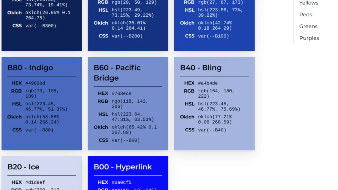
- All colors and their color values (including modern color spaces like OKLCH, print, and css variables)
- All downloadable files for their print materials.
- They can supply their print vendors with these links or a link to this site for any orders.
- Each link dynamically updates with the most up-to-date versions of the print materials.
- Other downloads such as Zoom backgrounds, digital ads, and a link to all of their stock photos.
- An extensive writing guidelines documentation, based off of Mailchimp's Voice and Tone

How was this guide created?
This guide was built using Vitepress, a Vite & Vue powered static site generator. It's open source, well documented, and can be built and deployed very quickly.
What's different about this installation?
Vitepress is built mainly for technical documentation. Think APIs and component libraries. We created a few components to help adapt this to become a style-guide.
You can view the source code and the two custom components on Github.
Vitepress Color Component
This color component takes a few variables and turns them into a great color card, converting one color into 5 different color variables using culori. The inputs are:
- Color Name
- CSS Variable name
- Color (typically HEX, but can use any color space)
- Text Color (for accessibility)
This outputs beautiful, responsive color cards for Vitepress:

Vitepress File Download Component
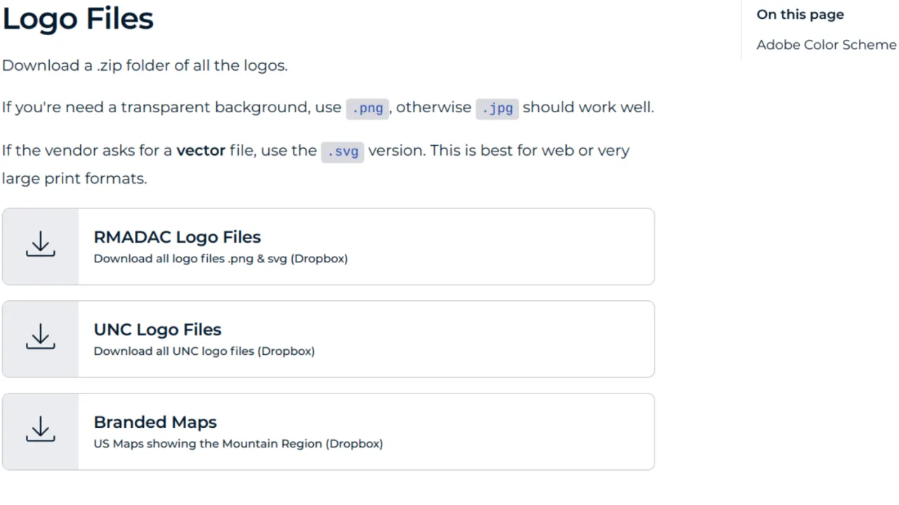
This component takes a few inputs to create a great looking component to download a file. This looks way nicer than just having a wall of plain hyperlinks on a page. The inputs for this are:
- Title
- Subtitle
- File Type (like .zip, .pdf, Dropbox link, etc.)
- File URL
We use a URL to a Dropbox folder in this case. This allows us to keep the links as-is and let Dropbox handle the version control of each file.
